
Youtravel.com - first review
The much talked-about new accommodation-only start-up Youtravel.com, which counts the likes of ex-Libra Holidays sales and marketing boss Paul Riches among its senior management team, launched today.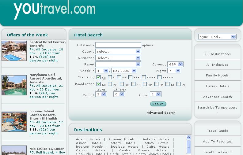 At first glance this morning there appeared to be no obvious technical glitches.
Positives: The site has a relatively simple design, making use on the homepage of handy boxed sections for destinations, bookings, sign-ups, suggestions and special offers.
The hotel search tool is as thorough as the user wants it to be, including options for board, facilities, check-in day, et al.
There is also a search-by-weather option – a nice, user-friendly tool that appears to becoming a rather popular piece of functionality following a similar launch by Wegolo earlier this month.
Negatives: more colour, please! [There are plenty of images of hotels and resorts, but often buried way down amongst the – very comprehensive – stack of details for each product]
Comments elsewhere ahead of Youtravel.com's launch pondered how much pay-per-click advertising would be needed in order to take on the reams of other bed banks, such as Hotels.com, Hotelopia.com, Lowcostbeds.com.
Perhaps Riches will tell us soon.
Kevin May, editor, Travolution

6 comments:
I'm a bit puzzled by the site. It's apparently aimed at both the consumer and agnets, although the login field is 'agent id' which might just put consumers off, and I think many consumers would just be confused by the search interface.
The geographical location of their properties isn't global. They state that one of the ways they'll make money is through the 'quality of the resort accomodation offered'. I wonder if they've therefore disovered properties that the rest of us don't know about?
The instructions at the bottom of the homepage on how to use the site are really odd, and really badly written.
And I'd echo the call for colour. The flat monochrome does nothing to inspire, or aid usability.
Nick Gassman
BA
I don't like it.
It's plain, dull and doesn't look like a accommodation or holiday website in the slightest.
When they told their designers curvy and web 2.0 please, I am not sure the designer quite got it or perhaps got it a little too much!
500,000 hits... what does that mean? page views? individual item downloads (i.e. each graphic, page, css file) - which is the technical definition. Really we want to know is number of visits... hits is kinda like measuring your newspaper circulation by number of pages read...
The site has serious usability problems - notable ones being the colour scheme (lack of contrast), lack of resizable text and the busy nature of the content. I've listed some of the usability concerns on my blog.
Dominic Sawyer
Just found this - not sure about it myself. Addition of colour would definitely help.
Post a Comment